Thursday, April 25, 2024

Two down, hurray!

Finally finished my piece for submission to the other exhibition. This one is known as 産経国際書展 or Sankei International "Sho" Exhibition. It is another major calligraphy exhibition in Japan, with the main exhibition being in Tokyo plus several regional exhibitions too.

I can't share the piece I am submitting here, but if it gets chosen, I will share it as a separate post in August (when the exhibition takes place). But here is a glimpse of one of the practice pieces.

And here is the rubbish generated in two weeks. Actually, there is a lot more rubbish, but I kept the candidates out of the trash, for now. So that's about 100 sheets for the trash.

And here are the keepsakes, which I keep because I wrote them a while ago, exploring how different combinations of inks, brushes, and papers.
 
I also make it a practice to keep the "finalists" too.
 
The next exhibition will be my calligraphy association's own internal exhibition at the end of the year. I still haven't decided what to write yet, but there are a few candidates in mind already. Meanwhile, for the next few months, I will probably be exploring different styles.

Tuesday, April 23, 2024

Comparing calligraphy seal pastes (part 2)

Usually, the seal pastes used in calligraphy works are vermilion or red. See this comparison for the different shades available. However, there are also other colours being sold, and they have their own uses.

First, if you are using white paper, or something of a similar light hue, you usually use red or vermilion seal paste. There is also brownish seal paste (usually called 仿古 or 古色) which works if you are trying to imitate something old. If you are using red paper, then you would use white or gold seal paste (gold usually for festive stuff). There are also other colours that can be used with coloured paper: yellow, silver, purple, and black. You choose the colour that contrasts well with the paper.
From left to right, white, yellow, and gold seal pastes. The yellow seal paste didn't turn out very well on the red paper.

Certain colours have special meanings, though, and should be used with discretion.

Pink is for love letters. Don't use pink seal paste unless you mean it.

Blue and green are to show that the writer is in mourning. Do not use them unless someone just passed away in the family.

However, in Taiwan, blue seal paste is also used on official documents. In such cases, the use of blue for work is acceptable, and those in mourning would use green seal paste instead.


Monday, April 22, 2024

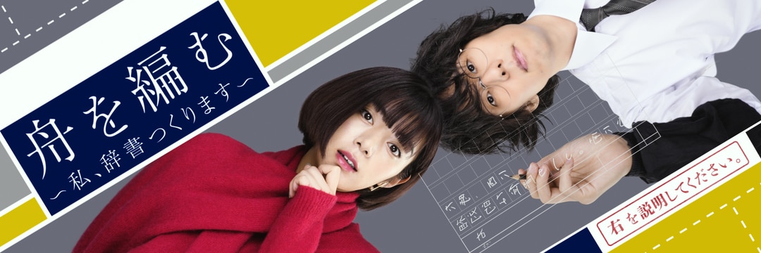
舟を編む (Fune wo Amu) NHK TV series (2024)


舟を編む (Fune wo Amu, English title The Great Passage) is a novel about a team of people making a dictionary. It was adapted into a live-action movie in 2013, and a TV anime series in 2016. In 2024, NHK made a live-action TV series that focused on the later part of the story, after Kishibe Midori joined the team.
 
While the story is about making a dictionary, it is actually about the importance of words. How words have meanings, how words help us to express what we are thinking. It is about why we create words: we create words because we want to pass something on. It is words that tie us together.

As someone who works with words, works based on words interest me. This story is no different. Having watched both the 2013 movie and 2016 anime, I was quite interested in this NHK series even before it started airing. NHK wasn't really known for making great drama series in the past, but in recent years, NHK seems to have taken a shift in policy and approach to try and appeal to younger viewers. I was curious how they would adapt this story today's audience.

And having finished watching the final episode today, I must say I was really impressed. By focusing on the second half of the story, after Kishibe Midori joined the team, this drama series was able to tell a story that relates to people who use smartphones and online search more than flipping through thick dictionaries. The final episode was even set mainly in 2020 and portrayed life under the COVID-19 pandemic. Its portrayal of what words are for, how we need to be careful in choosing words, and all those other aspects of words brought tears to my eyes many many times. I would never have expected I would cry while watching a TV drama about people making dictionaries. But that was what happened over the past few months, while watching this series.

I highly recommend this show to everyone. It will change the way you think about the words you use when talking to people.

Links:
舟を編む The Great Passage Wikipedia entry
The Great Passage (NHK TV drama)

A bit about the loss of two JMSDF SH-60K helicopters during night ASW training

Something a bit more serious.

On Saturday night, two JMSDF SH-60K helicopters crashed at sea during a night ASW training exercise. The exercise involved three helicopters (including the two helicopters that crashed), seven ships, and one submarine. At around 22:38 local time, radio contact was lost with one of the helicopters, followed by picking up the emergency location beacon of that helicopter. Radio contact was lost with the other helicopter at 23:04.


Search and rescue efforts recovered one of the crew (found dead), with seven still missing. The helicopters each carried one pilot, one co-pilot, and two other aircrew. The flight recorders for both helicopters have been found, in close proximity to each other, which led to the assumption that they had collided. Other helicopter parts have also been found.

First, the "lost radio contact" timings were about 30 minutes apart, so readers not familiar with naval operations would wonder why the helicopters could have collided. This is because helicopters do not necessary keep talking to their mother ships. In tactical operations, radio silence is usually maintained because radio communications can be picked up by the enemy, and those radio waves can be used to pinpoint your location. The nature of anti-submarine warfare (ASW) also means that helicopters may need to hover close to the sea surface at times (when dipping their sonars). The curvature of the earth then makes them drop out of radar detection and line-of-sight communications (like UHF). What happens then is that, for safety, helicopters have to check in with their mother ships at certain time intervals. When a helicopter fails to check in a certain number of times, it triggers certain responses as it means the helicopter met with some issue. This means that the second helicopter probably collided with the first, and when it failed to check in with its mother ship, the mother ship declared that it had lost radio contact at 23:04 local time.

I also want to mention how challenging night training at sea can be. Having conducted many many night training exercises at sea, the low level of light (sometimes zero if there is no moonlight) makes it very hard to pick up things around you visually. This is also why we conduct night training, so that people learn how to be effective lookouts at night, how to orientate themselves in low light, and how to operate effectively even when there is little (or no) light. For a ship operating in two dimensions, it is challenging enough. I had my own share of near misses at sea. For aircraft operating in three dimensions, it becomes even more challenging. This is why there are so many rules in place to prevent mutual interference between units (air or sea) in the same area, so that they don't interfere with each other, or endanger each other. One of the most basic rule is separation, either vertical or horizontal. First, you avoid having two aircraft in the same area. That's lateral (horizontal) separation. If they really need to operate in the same area, then you separate them by height (vertical). Each aircraft would be assigned a height block to operate within, and there is a buffer between height blocks as an added safety measure.

Even with all these safety rules in place, accidents still happen. Sometimes, it was because the rules in place were not stringent enough, and then we revise those rules to prevent future accidents. Sometimes, it is due to other aggravating factors (such as fog, bad weather, etc.) that made an already-challenging situation into something much more impossible. It could also be hardware issues (for example, an altimeter failure can cause the pilot to fly in the wrong height block). That is why accidents are investigated to understand their root cause(s). Procedures and rules are then revised to prevent future occurrences.

For the accident this time, I hope they eventually discover the root cause and make the necessary changes. Meanwhile, I pray that they find the seven missing crew members. Both are difficult tasks, since the accident happened out in open sea, with a depth of around 5,500m. Salvaging anything from the seabed is going to be a tremendous task.

Friday, April 12, 2024

Comparing calligraphy seal pastes (part 1)

I ordered some calligraphy seal paste from Taobao recently, and decided to do a comparison with the ones that I had bought, either from stores or via auction sites.

First, the pastes I bought on Taobao were from 双维 (雙維 or Shuang Wei or Shuangwei). This is a budget brand of calligraphy seal pastes, known for using long long long fibres and being a bit more sticky than other, more expensive brands. However, they are affordable and functional.

I also have pastes by 西泠 (Xiling) which is one of the leading brands in China. Other well-known brands are 苏州姜思序堂 (Suzhou Jiangsixutang), 漳州八宝 (Zhangzhou Babao), and 石泉 (Shiquan). All of them have different ways of calling their pastes, which can be confusing if you are looking for a similar colour from another brand. In this aspect, Shuangwei tries to use the names from Xiling so it is less confusing (or more, if you are trying to buy Xiling paste and end up ordering the same-named product from Shuangwei instead). (Another famous brand is from 龙泉 Longquan, but authentic Longquan calligraphy seal paste will cost a fortune, since it uses lotus silk. Needless to say, poor me does not own any such extravagant stuff. I also do not have any seal paste from 荣宝斋 Rongbaozhai, another famous brand.)

The biggest difference in price comes from the raw materials. Cinnabar is the core material for the vermilion colour of calligraphy seal paste, and the higher the cinnabar content, the more expensive it will be. Calligraphy seal paste is basically cinnabar mixed with some fibres (usually mugwort) and some type of castor oil to keep them together. The same 30g of paste can contain different compositions of these three materials depending on the brand. There is also what is called cinnabar "fat" (硃磦), which is a more yellow tint of the vermilion colour that is obtained when processing cinnabar. This "fat" is hard to obtain, accounting for like 1%, such that you need several kilograms of cinnabar to obtain maybe 30 to 60 grams of cinnabar "fat". So seal pastes that use more of this "fat" (which you can see from the colour) will cost more.

This is an example of their colours, placed with each other for comparison. For the photos, I took the photos, then adjusted various settings so that the colours of the seal pastes were as close as I could to what I saw with my eyes. Ignore the colour of the paper background as I did not care about getting its colour correct.


From 漳州八宝印泥:
贡品 (rank 3 out of 7 quality ranks from Zhangzhou Babao)
一级贡品 (rank 2)
特级贡品 (best quality from Zhangzhou Babao, aka rank 1)

From 上海西泠印泥:
古色 (a brownish colour mimicking seal paste from older times)
美丽 (a darker red)
青花光明硃砂 (the usual vermilion colour of cinnabar)
箭镞 (more yellowish tint)
镜面朱砂 (a higher quality of vermilion colour with a slightly brighter tint)

From 苏州姜思序堂:
硃磦 (made using cinnabar "fat")

From 石泉印泥:
精制美丽 (a darker red)

From 双维印尼:
堆朱 (common seal paste for everyday use)
朱磦 (vermilion with yellow tint)
黄磦 (yellowish seal paste; the colour is man-made using sulphur and mercury)
仿古 (a brownish colour mimicking seal paste from older times)

And 正红印泥 (maybe from 一得阁; this has a bright vermilion colour).
 
Good paste turns black when heated and reverts to vermilion when cooled. Apparently, pastes that contain higher amounts of cinnabar changes colour faster than those with less. I also wanted to test this, but I have not been able to find time to do this properly, so it will need to wait for now.


Wednesday, April 10, 2024

One down, one more to go

I sent out my submission for one of the upcoming exhibitions today (Mainichi Shodo Exhibition). This is a nationwide exhibition in Japan, with a rejection rate of around 50%. It is the first time I am submitting for this and I really have no confidence. But I promised my teacher that I would try for this, so here I am, after months of practising and preparing.
 
The actual deadline is next month, but I am submitting through my calligraphy association (they help to submit in bulk plus handle other admin stuff so it helps for a newbie like me) and the association has set the deadline as next week. So I thought I would just mail out my submission today so that I can meet the deadline.

Just an example, this is the amount of trash generated from about 2 weeks of practice. Actually, there should be more, but I always keep some used paper around in case I need to soak up ink or something. I also kept some of the better candidates as a memento, which I will probably throw away sometime in the future...

Keeping my fingers crossed. 🤞
Wish me luck! 🙏

Tuesday, April 09, 2024

欲語涙先流 calligraphy piece

The piece I am submitting for the other exhibition (deadline in May) will be based on the poem 武陵春 by 李清照 Li Qingzhao. I am still practising for this other piece. Here is a piece that uses the phrase 欲語涙先流 from this poem.

Monday, April 08, 2024

譬如朝露 calligraphy piece

Here's some more pieces using the phrase 譬如朝露 from Cao Cao's 短歌行 poem, because I needed to test out some paper I got from Yahoo Auctions.


The deadline for one of the exhibitions is next week, and I have already written a few candidates. The final step is to select the one that I will actually submit. Wish me luck!


對酒當歌 piece

I have been preparing two pieces that I hope to submit for two upcoming exhibitions, practising about 2 hours almost every night for the past 3 months.

Here's an excerpt of one of the pieces, which contains the phrase 對酒當歌 from Cao Cao's 短歌行 poem. I wrote them because I had some paper I wanted to test out.


Saturday, April 06, 2024

Full bloom

The cherry blossoms started blooming a bit late this year due to the unusual weather. It was hotter than usual in February and everyone was expecting the cherry blossoms to bloom early, but then, March suddenly turned cold again, and in the end, the cherry blossoms only started to bloom toward the end of March.

Still, the weather turned quite warm for this season, which meant that it took less time to reach full bloom.


The birds also came out to enjoy.
 

Some other flowers were blooming too. Truly, spring is here.

My violets are in full bloom too!


Thursday, April 04, 2024

Legend of the Red Dragon aka LORD (BBS door game)

OMG! I went to visit my favorite blog talking about old CRPGs, and came upon this! Legend of the Red Dragon, back from the good old days of BBS door games. I can't remember the countless hours I spent playing it back in the 1990s, when I was calling into BBSs.

It seems you can play a rewrite of the original game today, via your browser (instead of calling into a BBS).

Oh, the good old days... nostalgia can be addicting.

Thursday, March 21, 2024

Sambar deer hair (山馬毫) calligraphy brushes

In 2008, the sambar deer was listed as a vulnerable species on the IUCN Red List. This affected the use of its hair for calligraphy brushes, which used to be sold with names bearing the characters 山馬 in some form. Sambar deer hair is very rigid, more rigid than horse and weasel hair, but maybe less than boar hair.

I do have a few of such calligraphy brushes made from sambar deer hair. As usual, a 500 yen coin is there for size comparison.

From right to left:
The rightmost brush with a black handle was bought at a calligraphy supplies store in Singapore many many years ago. The brush portion is 55mm long with a diameter of 12mm. It served me well when I was writing pieces on 半紙 size paper (24.3x33.4cm).

The middle three brushes were given to me by a relative. The unused one, second from the right, has a brush portion that is 45mm long with a diameter of 7mm.
 
The third one from the right has a brush portion that is 45mm long but a diameter of 8mm. I sometimes use this brush to sign calligraphy works, especially when the work is written with a large soft goat hair brush (such as this, these, and this).
 
The fourth brush from the right (or third from the left) has a brush portion that is 60mm long with a diameter of 11mm. I also use it for writing on 半紙 size paper.

Meanwhile, the two brushes on the left were bought recently when a calligraphy supplies store was clearing stock. The leftmost brush has a brush portion that is 52mm long with a diameter of 7mm, while the second one from the left has a brush portion that is 34mm long with a diameter of 5mm. I found them at a very discounted price so I thought I would get them in case I ever need something like them in the future.

Wednesday, March 20, 2024

Dune Part Two at Dolby Cinema

After watching Dune Part Two at an IMAX theatre, I needed to watch it at a Dolby Cinema for comparison.


Compared to my experience watching Dune Part One at a Dolby Cinema and IMAX theatre, I think for Dune Part Two, the IMAX experience was better overall. The reason is the aspect ratio. IMAX has a taller screen and this time, the movie made full use of the taller screen to show a bit more. Here, the Dolby Cinema experience lost out, since it uses the normal cinema screen aspect ratio. In terms of sound, I also felt the IMAX experience had more impact. Maybe it was just this time, but I found the Dolby Cinema sound to be somewhat softer that I remember. To give it the benefit of the doubt, I would say IMAX and Dolby Cinema are on par for sound.

In conclusion, this time, for Dune Part Two, the IMAX experience was better, but only because the movie was able to make proper use of the taller screen (compared to Dune Part One, where the IMAX part felt more like an afterthought). It is nice to have a movie advertise itself as "Shot for IMAX" and actually deliver. Still, not many movie actually deliver on such an advertising promise, so I would say, to err on the safe side, the Dolby Cinema experience is usually more consistent.

Monday, March 18, 2024

Yamada Naoko's new movie Kimi no Iro announced

Finally, we get a date on when director Yamada Naoko's new movie Kimi no Iro will premier.

Today, it was announced that Kimi no Iro will premier in Japan on 30 August 2024. A trailer has also been released, together with the names of the main cast.
 
One thing I noted was that the main cast are not voice actors by trade. Rather, they are three young actors and a more experienced one.

Official website: https://kiminoiro.jp/
 
This movie brings back the trio from Liz and the Blue Bird: Yamada Naoko as the director, with a script written by Yoshida Reiko and music by Ushio Kensuke. I am so looking forward to this. 

Saturday, March 16, 2024

Random haiku

春霞 
かがやきのせて 
北陸へ
 
Note: Hokuriku Shinkansen (北陸新幹線) is being extended to Fukui today. Kagayaki (かがやき) is the name of the fastest train on this line.